All Dried Up!
Posted by Owner-Aspen on 16 Apr 2019, 11:12 pm
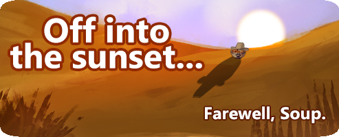
All the Soup is gone... for now.
Soup related battlegrounds and explore events have left us for the year, but you may elect to take this trophy for your profile to remind you of Soup!

We do also hope you like the new town icons, which appear next to your user name.
And now it's time to enjoy a few weeks of relaxation as we prepare for Olde Foxbury's annual festival. The festivities are scheduled to start in mid-May, so stay tuned for details as we draw closer. We have some new surprises in store this year!
Have a wonderful day!
- Aspen -


RIP my unicode idea didn't work.
I love the new QP and OD icons, and the OFB and TEP ones are alright, but the DMM one should really be changed imo, like others said. I honestly think the moon was perfect for DMM.
My favorite ideas for the icons (tried to copy the unicode glyphs so lets see how that goes)
QP: Serpent Dragon (current)
OD: Narwhal (current) or maybe Anchor
TEP: Snowflake (from the winter festival icons)
DMM: Moon or Claw Marks (from halloween icons)
OFB: Shield or Crown are both fine, but I think maybe a Castle theme would be best for OFB: either Fort Awesome or the Chess Rook (or Knight but that might be a bit too vague) would be really great.
Clawtooth (shhh let me dream): Campground
the icons look like it's from Animal Jam, their phantoms
Ohh i love the soup with the cowboy hat lol so cute
Abd a festival OwO no clue what it is but i sounds fun
I think Hawkfeather put it in to words. Before the DMM icon was a moon, now is... Is... a Spike... ball? A mace? Cant tell. All those spikes makes it harder to identify what we are seeing. The Narwhal is decent, but the tail is too thin. At a first glance I see a whale. Takes a bit of time to identify the horn, QP is too detailed too, TEP kinda works as is just a mountain (but a lil boring one at that) and OFB doesnt bode well for some reason. The Shield was rounder and softer looking i guess. Unlike the spikey crown.
If these are intended to permanently replace the original icons, I'm not sure I'm a fan. It's hard to put my finger on why, but I think they're just a little too detailed for how small they get. The detail catches my eye but they get so small I have to look at them longer to really determine what they are. It's not a big deal at all, and I do like the images themselves, I just think they don't "read" as well for at-a-glance town signifiers as the old icons did.
I feel like I have a special offer sticker by my name now :( I hope this one isn't permanent.
I'm looking forward to the OFB festival though!
the Crown is nice and all but I really liked the shield a lil better.
Could there be an option to have the old icons back? ówò
See ya, Soup Cowboy. It was a fun ride~
*leans into the mic*
Goodbye you little punk